Wouldn’t it be great to have a say in what eM Client looks like?

Well, we decided to offer the opportunity to do just that and design your own eM Client.
Since eM Client 8.1, all users can openly participate in what eM Client looks like - not only the advanced users, but also the ones who are unfamiliar with the color format "#FF9999" and similar technicalities.
This is thanks to our own WYSIWYG (What You See Is What You Get) theme editor, which allows you to adjust each and every corner of the application to your liking.
Let’s introduce the individual functions of the editor and its concepts to help you quickly navigate yourself through the process.
Where to begin
After opening the editor in a new window, the theme you are currently using in eM Client will be loaded automatically and you can start editing it immediately (this function is available from version 8.1.973, download latest version here).
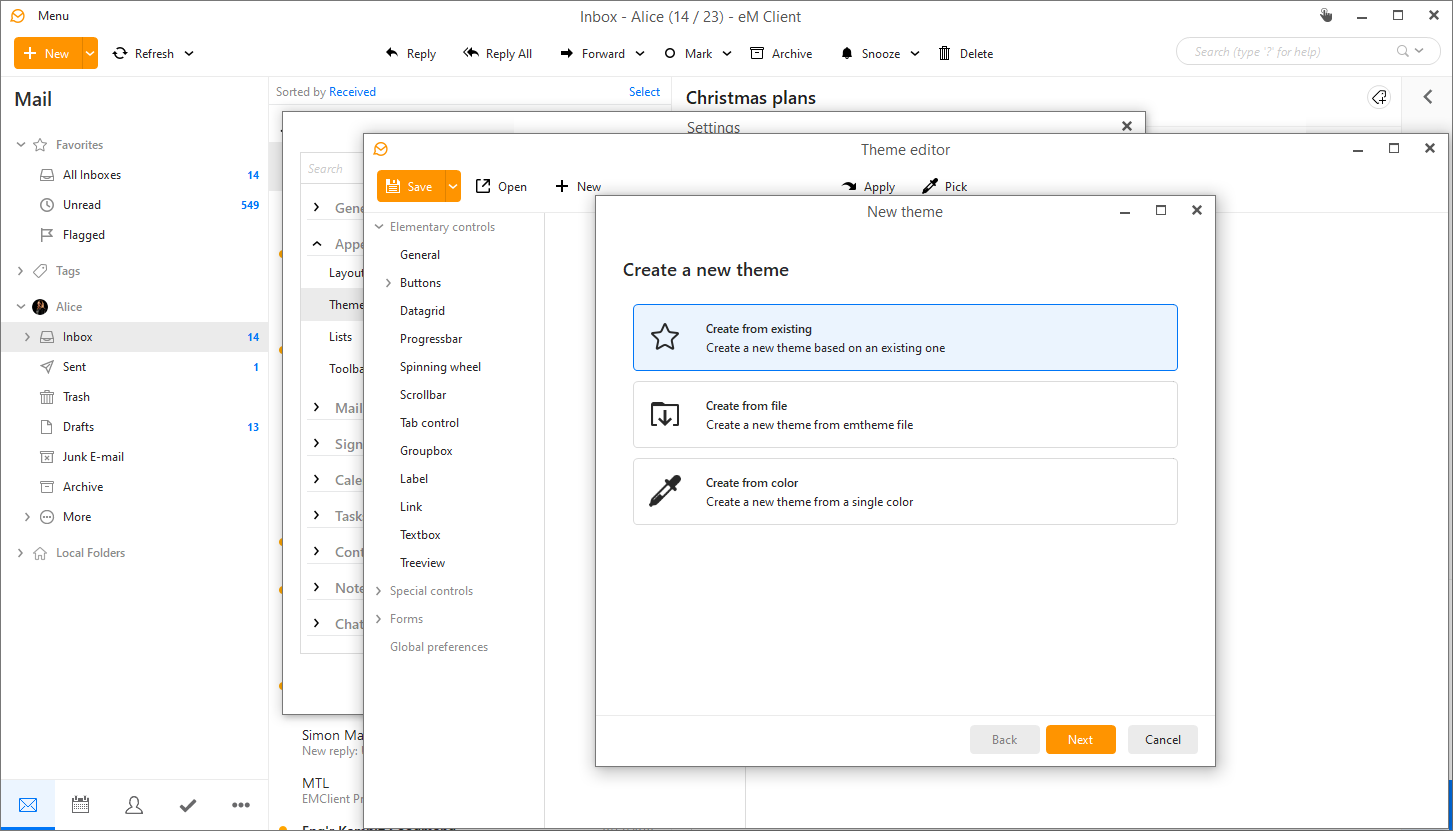
If you want to start from scratch and create a new theme (or edit an existing theme), click the "New" icon. A new window will open in which you can choose one of three theme editing options:
- Create from existing - this option allows you to make cosmetic changes to one of the existing themes that you like. Use it for fine-tuning small details.
- Create from file - use this option to select any custom theme (.emtheme) file. You can also edit theme files created by other users. See our theme gallery.
- Create from color - with this option you can simply select a color from the color palette for a visual element and the editor will automatically distribute the colors of individual controls for you.
 eM Client Theme Editor: Create new theme
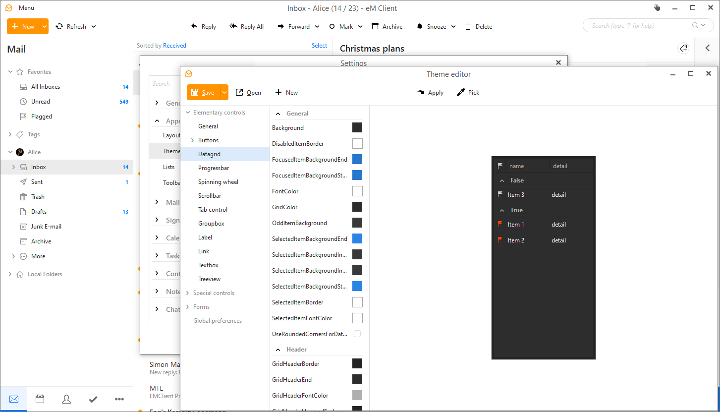
Click the "Finish" button to confirm your choice and start editing the selected theme. In the theme editor, you have a complete overview of all graphic elements of eM Client.
They are divided into "Elementary" and "Special" controls, “Forms” and “General preferences”.
 eM Client Theme Editor: Editing
Graphic element categories
- Elementary controls: These are the basic elements that you will encounter most often in eM Client – the texts, backgrounds, buttons, text boxes, and other simple elements used across the application.
For example, if you want to enable wider scrollbars, you can now easily find the setting under Elementary controls > Scrollbars, and check the UseSystemScrollbar option.
- Special controls apply to graphic elements that have a specific use, especially in the calendar, contacts, sidebar, attachments and some other sections of the application.
- Forms are, in layman’s terms, individual "windows" through which you control eM Client (e.g., the window for writing messages, creating a new event or contact, etc.). For those you can change colors as well as their other properties.
- General preferences: Here you can change the name of the theme, add the author name and a preview in the form of a screenshot. You can also use the "IsDarkTheme" switch to determine a dark type theme, which will invert all icons to white.
To apply the theme you have modified, just click the "Apply" button in the top bar of the editor (or use F5 key as a shortcut).
 eM Client Theme Editor: Saving
Useful tips
Some elements may appear in more than one category in the editor. This is to be able to distinguish the properties of the same graphic elements in two different places. In these cases, the more specific setting takes precedence over the more general one (this applies in particular to the main window and sidebar).
This means that if you don't see a color change where you'd expect it to, try to see if the element can't be changed for a more specific location.
Important: If you are not sure which category the specific element you want to change falls into, use the "Pick element" button (or F6 key) and simply click on the object in the eM Client whose attributes you want to change.
After each modification, you must click the "Apply" button again for the changes to take effect in the eM Client interface.
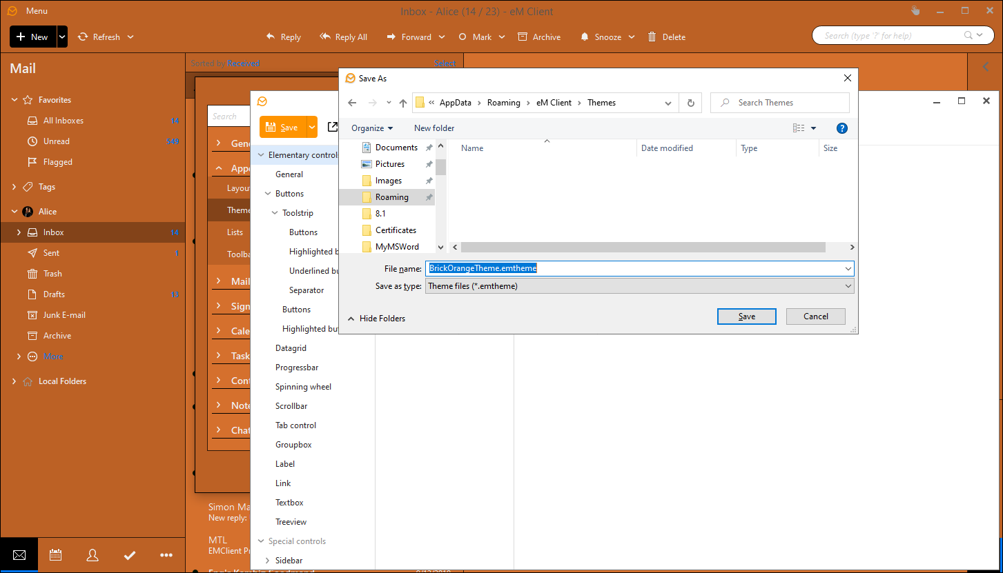
Also, don't forget to save your newly created theme after you’re finished and name it appropriately so that you can quickly find it for future use. You have to import the saved theme into the program in the menu Settings > Appearance > Themes > Import.
Pro tip no. 1:
In the color selection window, the most frequently used colors in the given theme are in the upper row. The bottom row, on the other hand, shows the most recent colors you set.
And what is the difference between RGB and HSB? The RGB or red-green-blue color model is an additive color mixing method used in color monitors and projectors (it is the mixing of emitted light).
HSB is a color model that uses hue, color saturation, and brightness. It corresponds better to the human perception of colors and is better suited, for example, in situations where it is necessary to find a lighter or darker shade of the same basic color.
Pro tip no. 2:
If a color does not look good somewhere, it is likely that the combination will be the same in other places in the program as well. Therefore, the "Replace this color everywhere" option in the color selection window may be useful.
Share your themes
If you are satisfied with the result, do not hesitate and share your themes with us at [email protected]. We will take care of their publication.
You can also quickly import themes from someone else using the "Import" button in Settings > Appearance > Themes > Import.